Collins Dictionary 2020 Word of the Year campaign
Keeping it simple
The beauty of a well-executed sketchnote is that it takes a wealth of complex information and presents it visually, making the information itself more memorable, shareable and easily understood.
So, in the spring, when the threat of the pandemic was looming large and the volume of vitally important public health information was increasing daily, it was only natural that we should sketchnote it.
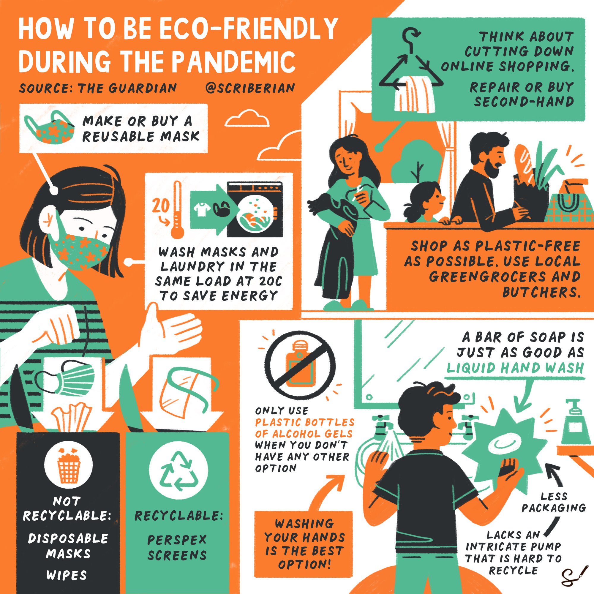
Our first sketchnote, on handwashing, became one of our most popular sketchnotes to date, translated into multiple languages and shared widely around the world. We went on to sketchnote the definition of social distancing, as well as practices for creating corona-safe workplaces, tips on protecting your mental health during lockdown, advice on eco-friendly pandemic living (below), and much more. (All of which can be found in the resources section of our website).
Communicating the science
Using visuals to convey complex scientific ideas has long been a mainstay of our work with collaborator, Oxford Sparks. During the pandemic, they asked us to create an animation explaining how scientists go about the vitally important work of modelling and predicting the way in which a new virus will behave.
Visual metaphor is so often the key to clear and impactful science communication - after all, we're not all familiar with pathogens and methods of scientific modelling. This animation, which likens the virus to a puzzle to be solved, contributed to important efforts to inform the public about how the pandemic was being tackled.
Clear and concise guidance
Administering the test on yourself or a family member is a far from straightforward procedure for the untrained. Early in the pandemic, our team produced a set of illustrations to accompany the NHS Covid19 home-testing kits. The clarity of those instructions rested on the quality of our illustrations. Our aim was to simplify an intimidating process, which, at the time, was being carried about by 16,000 people in the UK every day.


Visualising a better future
Of course, our clients outside of scientific and medical fields faced significant communication challenges of their own during this time. As the world shifted to working remotely, our digital scribing service enabled virtual teams to stay connected, ideas to be captured and collaborated on, and events to go ahead.
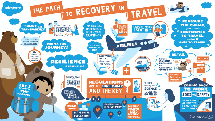
And, the more of these conversations we scribed, the clearer it became that the creation of a shared vision is especially valuable when people cannot physically be and work together. Below is a digitally scribed panel discussions, hosted by Salesforce, for their clients in the travel industry which, of course, was hit especially hard at that time.