Twitter's historic research illustrated and animated
How do you take big data and turn it into something human, approachable and engaging? When Twitter embarked on the History In The Tweeting project to understand how the pandemic experience might shape us all, illustration and animation provided the answers. Their hugely successful illustrated and animated global campaign has achieved 20 million impressions and almost 10 million video views.
In 2020, Twitter UK embarked upon a research project to better understand how COVID19 affected the world. Twitter analysed millions of Tweets, boiling the data down into a set of seven behaviours and states, which have emerged or accelerated during lockdown. Twitter understood that this dramatic shift in behaviour provided a rare moment for brands to reconsider how things have always been done and to enact change.
The challenge Twitter faced was how to make their data-heavy findings more approachable and communicate them to its audience of media agencies, marketers and business leaders, to help them navigate in uncertain times. Twitter needed a set of engaging and inclusive visuals, which captured the experiences of everyone and excluded no one, to grab these brands’ attention and provide them with clarity during a moment of global uncertainty.

"Twitter has people at its centre, so, stylistically, we wanted the campaign to be as accessible and as human as possible. That’s why we took the road of using illustrations."
Ciara Brady, Senior Marketing Manager, Twitter
Twitter understood from the outset that illustration would be an effective tool for differentiating their research from competitors. Ciara Brady, Twitter’s Senior Marketing Manager, explains: “Before we kicked off this project - in the early days of lockdown - we did a benchmarking exercise to see what was out there from our competitors about the impact of Covid on advertising and media.
"Everything we found was very 'white paper', very dry and corporate. Twitter as a platform reflects conversations. Intrinsically, it is something that has people at its centre, so, stylistically, we wanted the campaign to be as accessible and as human as possible. That’s why we took the road of using illustrations. So when people are scrolling through their timelines they would pause on the video or on the gifs, as something different to other companies who were responding to Covid.”
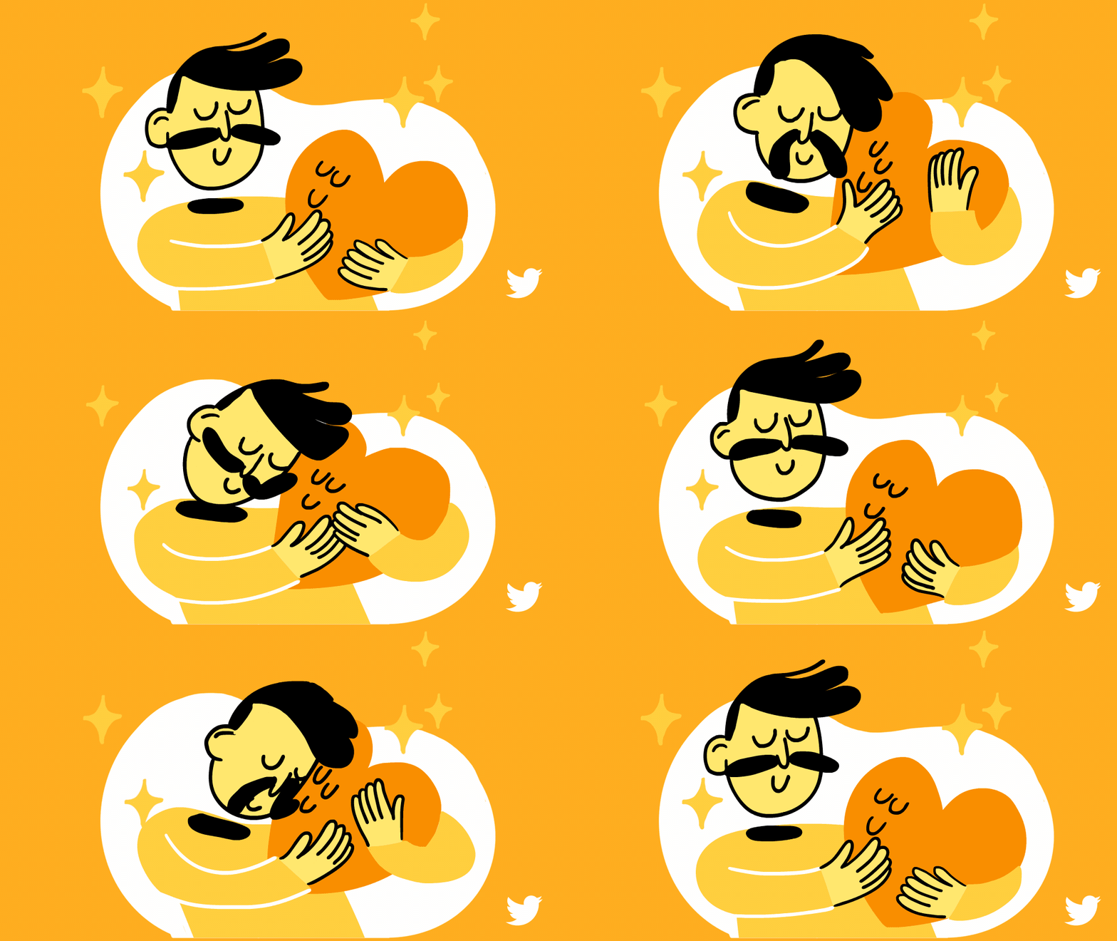
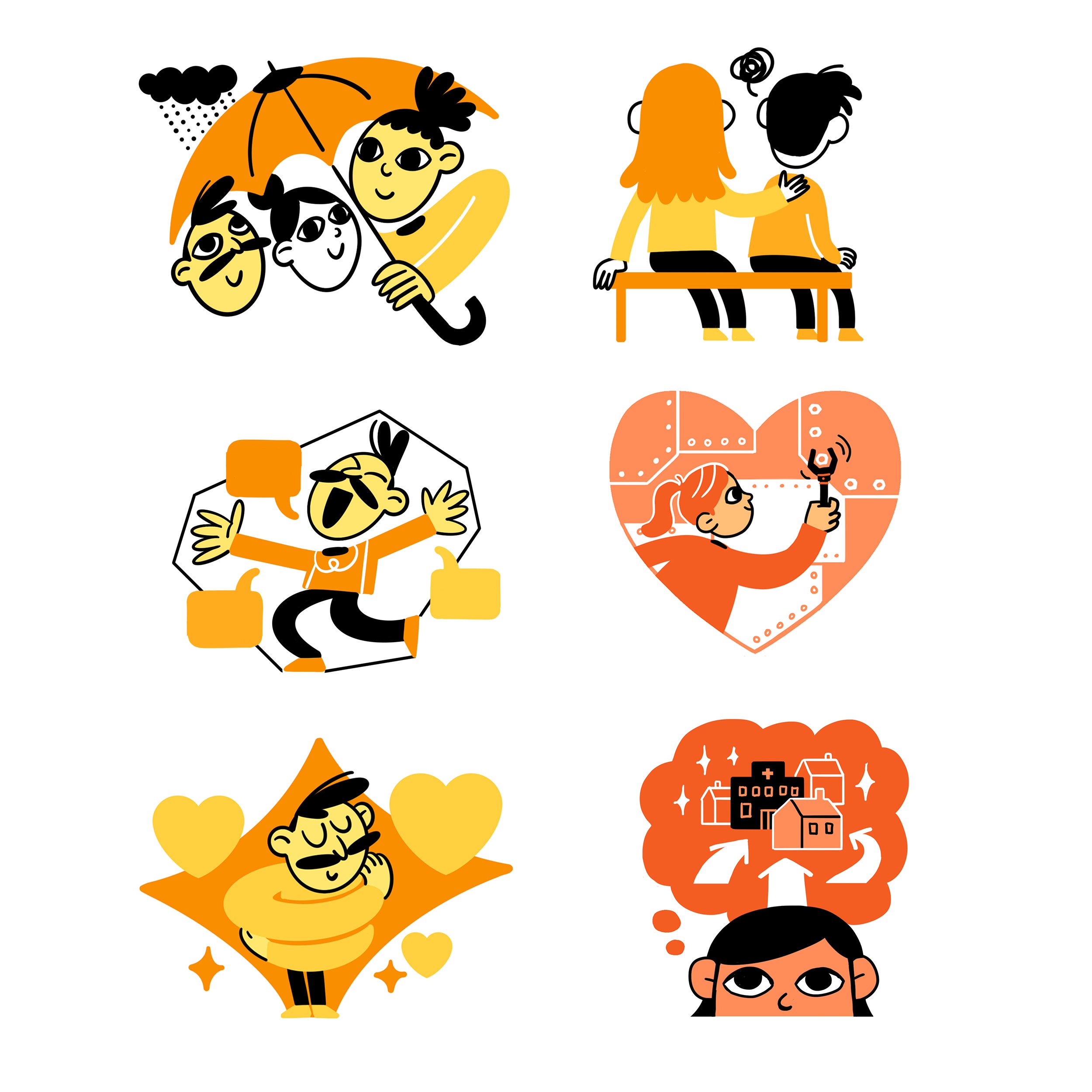
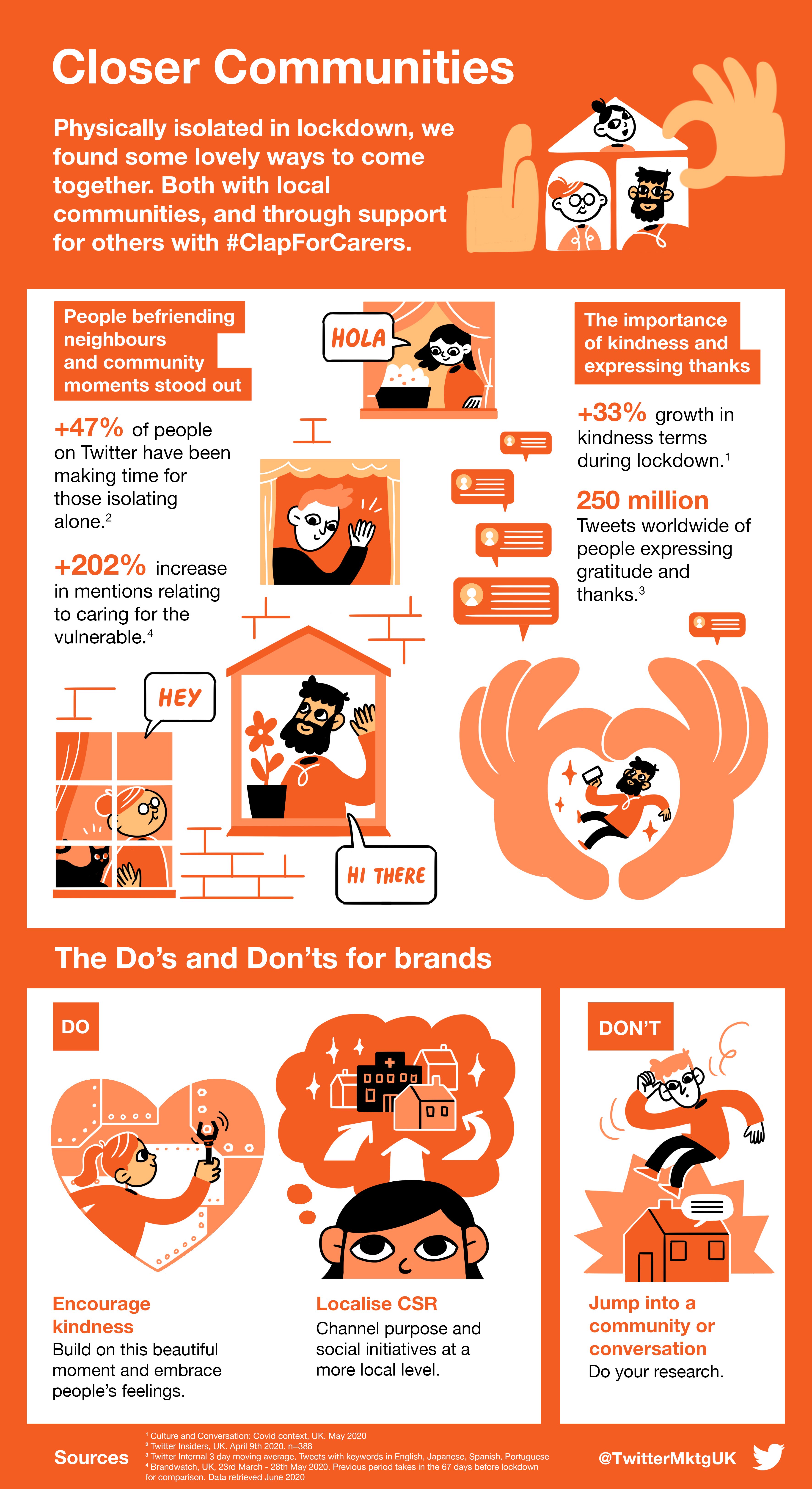
Scriberia’s illustration and animation teams worked together, reimagining these characteristics as a series of vignettes; each behaviour was highlighted by a different character, who would feature in a series of approachable illustrated images, social-media friendly GIFs, infographics and fully animated video assets.
“I was impressed with how Scriberia brought the different trends to life," says Gordon Macmillan, Twitter’s Head of Editorial. "The graphics really embodied the trends and told a story in themselves, and that’s what we were looking for.”
Ciara adds: “There’s a lot more flexibility with illustration than with photography. With the topics we were covering: mental health, communities, social distance, we didn’t particularly want to restrict ourselves with photography. The illustrators were perfect, they digested the research itself and came up with vignettes that perfectly captured the data point.” 
Twitter enjoyed immediate success from the campaign. The hero animation was viewed over 9,475,850 times and its campaign received over 20 million impressions in total. Furthermore, Campaign magazine did a feature on the project - and the UK campaign was also adapted to run in MENA, Canada and Brazil, creating a truly global experience.
Ciara explains: “We couldn’t have done this project justice without animations and illustrations from Scriberia. Not only did they give it levity, but they made it so easy to understand."
 “We would certainly work with Scriberia again - 100% - and would definitely recommend working with them. It was a pleasure from start to finish.”
And Gordon agrees: “It was a big project for us, and one that we needed to reach the market quickly. Taking a new creative route could have been a risk, but we really enjoyed working with Scriberia; it was a seamless process for us. There were no hiccups and the team responded quickly to feedback.
"And, at the end of it all, the work went down really well. It helped us to tell the story, and it did it in an interesting and original way - I don’t think we could have asked for anything more.”
